
Onsi University
SOLE PRODUCT DESIGNER
Designing a Compliance Platform From the Ground Up
Delivering government contracting and legal compliance education requires balancing dense regulatory content with seamless administrative oversight. Built from zero-to-one, Onsi University’s Learning Management System bridges this gap through a scalable, dual-sided platform that turns intricate corporate training and auditing workflows into intuitive user experiences.
DURATION
Jun - Nov 2025
PLATFORMS
Desktop, Web
COLLABORATORS
Kateryna Kazachkova (Mentor), Impulse Creative (Dev team)


Stepping into a small, fast-moving startup environment as the Sole Product Designer, I owned the end-to-end product footprint. I wore multiple hats simultaneously—acting as the primary user researcher, interaction designer, UI designer, and design system builder. I designed the full learner-facing ecosystem and complete backend administrator console, driving every screen from initial whiteboard concept directly to high-fidelity developer handoff.


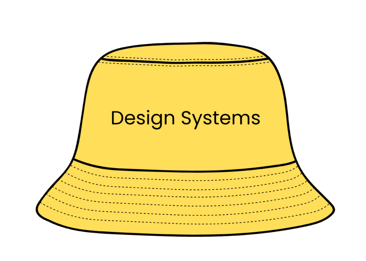


me and my many hats
Although framed internally as a product redesign, there were zero existing design patterns, no shared UI libraries, and no pre-established design guidelines. Working under a lean startup launch deadline, I had to confidently navigate extreme ambiguity, make foundational system-level architecture decisions independently, and establish scalable product processes to ensure the application was ready to ship.

literally nothing...

but i get to have my nara smith moment!

Uncharted territory
Stepping in as the sole designer without pre-existing frameworks presented an exciting challenge. Instead of letting ambiguity slow down momentum, I used the opportunity to establish core design processes, align stakeholders early, and build a scalable foundation from the ground up.
Figuring out the landscape
Because this was a B2B enterprise LMS targeting government contractors and compliance professionals, I focused my research on understanding existing LMS patterns and identifying what worked and what didn't for similar platforms.
I analyzed platforms including Coursera for Business, TalentLMS, Docebo, and LinkedIn Learning, evaluating them across several dimensions: navigation structure, course discovery, progress visibility, certificate handling, and dashboard design.


the insights
Action-First Architecture
Most LMS dashboards overwhelm users with excessive options. Leading with a clear 'pick up where you left off' pattern minimizes cognitive load and drives immediate engagement
Progress as a Primary Cue
Buried progress indicators stall user momentum. Making advancement metrics prominent across all screens maintains motivation throughout long-form compliance courses
Rewarding the Finish Line
Certification retrieval is often treated as a administrative afterthought. Streamlining this flow transforms completion into a seamless, rewarding milestone.
Flattening the Admin Learning Curve
Enterprise admin tools are frequently powerful but disjointed. Grouping high-frequency actions into modular control panels eliminates the steep learning curve for non-technical managers.

How might we transform complex, heavily regulated compliance training into a clear, motivating learner journey backed by a frictionless administrative workspace?
from friction to flow
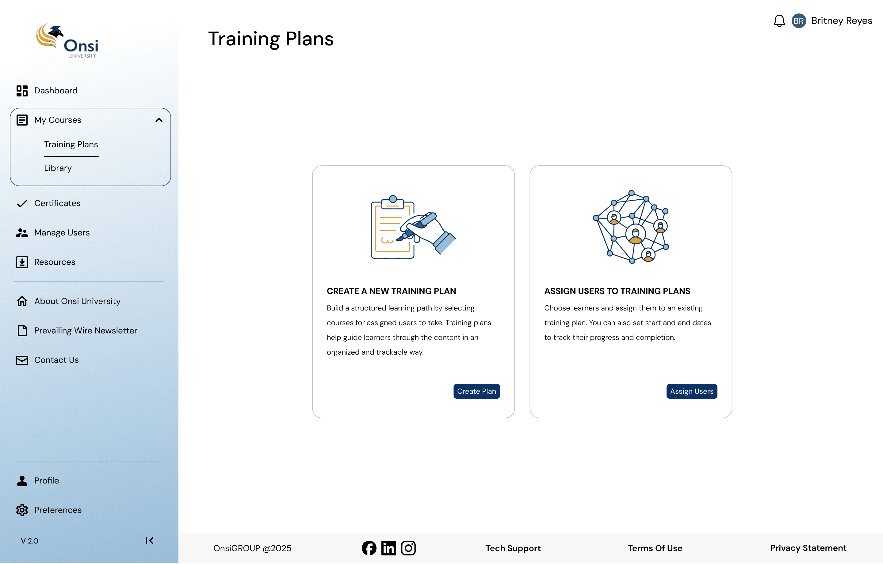
To solve dashboard clutter and administrative overwhelm, I architected the LMS around a modular, action-first design system. The result is a dual-sided platform that prioritizes learner continuity while streamlining backend administrative workflows.


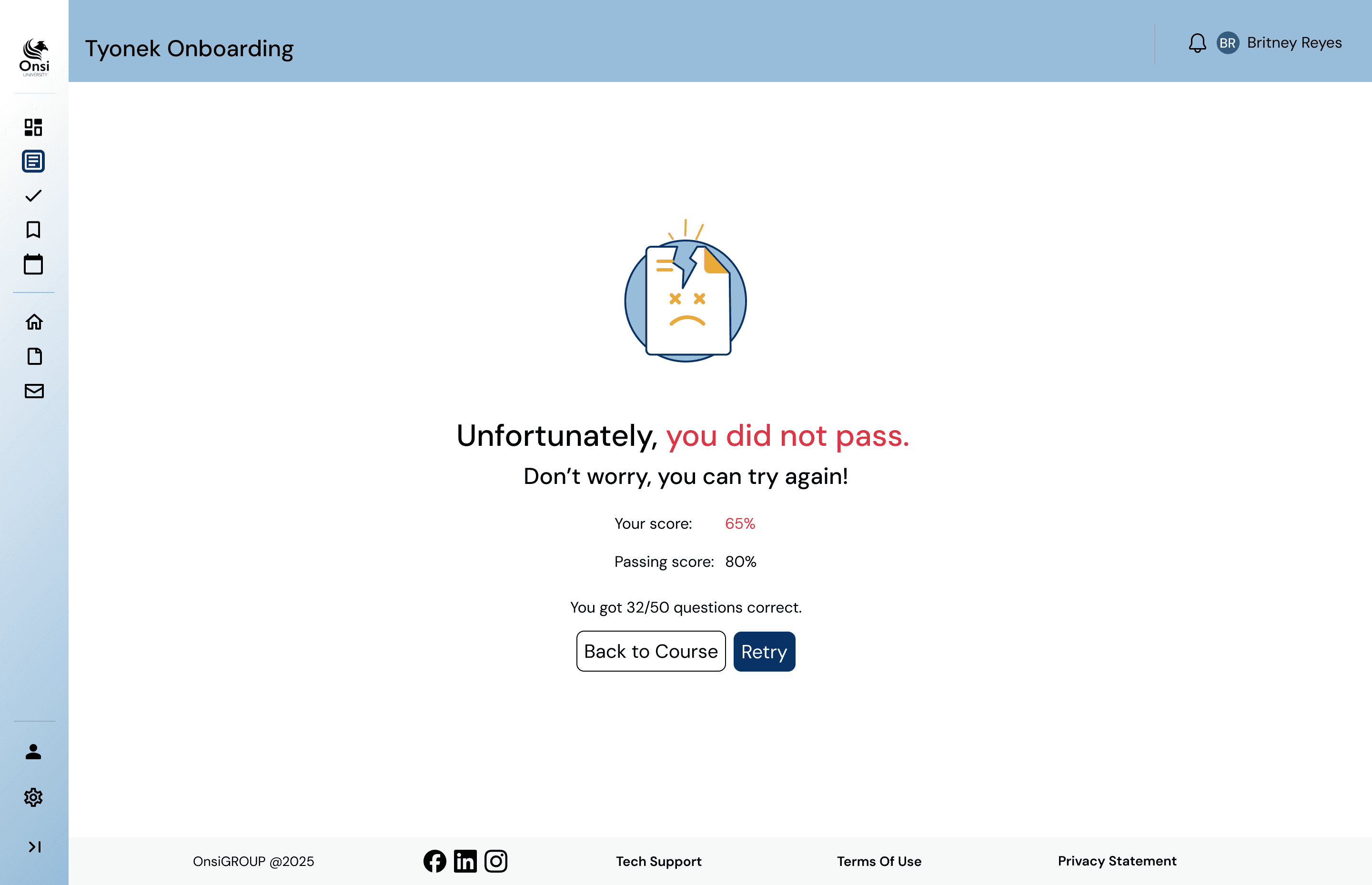


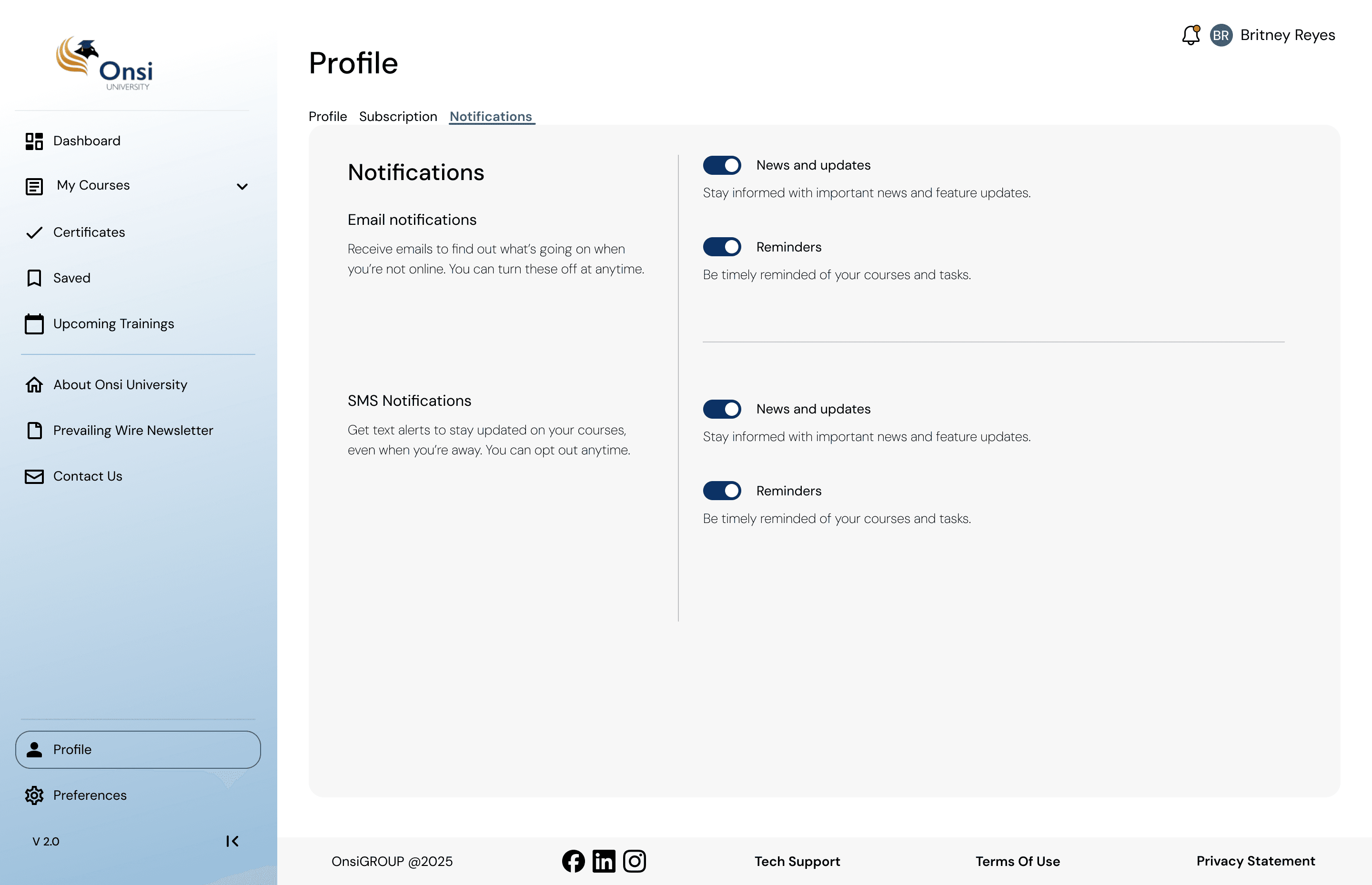




final user-facing screens

final Admin-Facing screens
Designing Through Constraints & Dev Alignment
Transitioning designs from concept to production revealed unexpected technical constraints late in the process. The development team was working within existing platform architecture and scope limitations—meaning several complex data tables I had initially envisioned had to be re-engineered into responsive card structures to fit budget and timeline requirements.

Time

Budget

Scope
Rather than viewing this as a roadblock, I used it to bridge the gap between design and engineering. I adapted the UI components without sacrificing usability and established earlier feedback loops with the developers. This reinforced a crucial lesson: product design isn't just about crafting ideal layouts, but finding the sweet spot between user experience, scope, and technical feasibility.
what i learned
Sometimes the best thing to do is get thrown into the fire.
Stepping into my first real-world product design role and owning a shipped project from start to finish was an incredible "thrown into the fire" experience. While I am proud of the final solution delivered, the most valuable part of this journey was the sheer volume of hands-on learning that came from navigating real-world constraints.
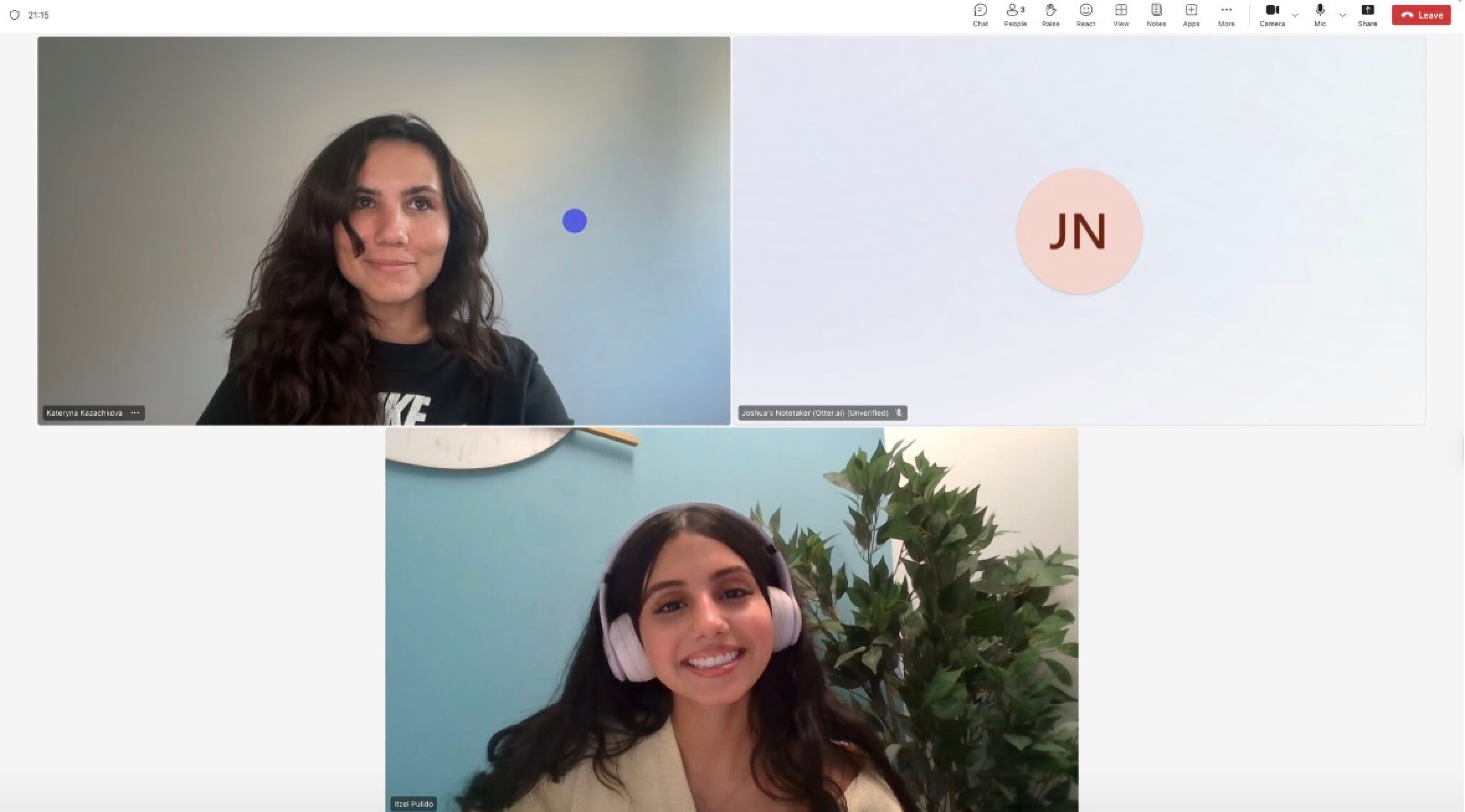

a quick shoutout to my amazing mentor
I had the privilege of being mentored by Kateryna Kazachkova throughout my time at The Onsi Group, and the experience was nothing short of transformative for my growth as a designer. Her guidance not only sharpened my execution and strategic thinking, but also gave me the confidence to step up and own complex product decisions from day one.

good mentorship is so important!
Ultimately, I am profoundly grateful for the trust, mentorship, and creative freedom I was given so early in my design career. This project didn't just teach me how to build a better user interface; it taught me how to be a resilient, collaborative, and adaptable product designer.
FEEDBACK FROM stakeholders AND team members
Kateryna Kazachkova
Senior Product Designer
“Itzel asked thoughtful questions, welcomed feedback openly, and showed a real sense of ownership throughout the process”
Joshua Hinckley
VP of Business Development
“It’s rare that I write a recommendation where my only hesitation is that I’d rather keep the person myself, that’s exactly the case with Itzel! ”
Impulse Creative
Dev Team
“We were very impressed by the design work done for the platform and appreciated how thorough and thoughtful the decisions were.”
see next
mobile pwa
hallway
a streamlined concept to help remote and hybrid teams foster organic connections and cross-functional collaboration.
bfi for civic tech platform
an ai-powered platform ecosystem that modernizes how municipal agencies manage and process civic data.
Onsi University
SOLE PRODUCT DESIGNER
Designing a Compliance Platform From the Ground Up.
Delivering government contracting and legal compliance education requires balancing dense regulatory content with seamless administrative oversight. Built from zero-to-one, Onsi University’s Learning Management System bridges this gap through a scalable, dual-sided platform that turns intricate corporate training and auditing workflows into intuitive user experiences.
DURATION
Jun - Nov 2025
PLATFORMS
Desktop, Web
COLLABORATORS
Kateryna Kazachkova (Mentor), Impulse Creative (Dev team)
Stepping into a small, fast-moving startup environment as the Sole Product Designer, I owned the end-to-end product footprint. I wore multiple hats simultaneously—acting as the primary user researcher, interaction designer, UI designer, and design system builder. I designed the full learner-facing ecosystem and complete backend administrator console, driving every screen from initial whiteboard concept directly to high-fidelity developer handoff.
me and my many hats
Although framed internally as a product redesign, there were zero existing design patterns, no shared UI libraries, and no pre-established design guidelines. Working under a lean startup launch deadline, I had to confidently navigate extreme ambiguity, make foundational system-level architecture decisions independently, and establish scalable product processes to ensure the application was ready to ship.
literally nothing...
literally nothing...
but i get to have my nara smith moment!
Uncharted territory
Stepping in as the sole designer without pre-existing frameworks presented an exciting challenge. Instead of letting ambiguity slow down momentum, I used the opportunity to establish core design processes, align stakeholders early, and build a scalable foundation from the ground up.
Figuring out the landscape
Because this was a B2B enterprise LMS targeting government contractors and compliance professionals, I focused my research on understanding existing LMS patterns and identifying what worked and what didn't for similar platforms.
I analyzed platforms including Coursera for Business, TalentLMS, Docebo, and LinkedIn Learning, evaluating them across several dimensions: navigation structure, course discovery, progress visibility, certificate handling, and dashboard design.
the insights
Action-First Architecture
Most LMS dashboards overwhelm users with excessive options. Leading with a clear 'pick up where you left off' pattern minimizes cognitive load and drives immediate engagement
Progress as a Primary Cue
Buried progress indicators stall user momentum. Making advancement metrics prominent across all screens maintains motivation throughout long-form compliance courses
Rewarding the Finish Line
Certification retrieval is often treated as a administrative afterthought. Streamlining this flow transforms completion into a seamless, rewarding milestone.
Flattening the Admin Learning Curve
Enterprise admin tools are frequently powerful but disjointed. Grouping high-frequency actions into modular control panels eliminates the steep learning curve for non-technical managers.
How might we transform complex, heavily regulated compliance training into a clear, motivating learner journey backed by a frictionless administrative workspace?
How might we transform complex, heavily regulated compliance training into a clear, motivating learner journey backed by a frictionless administrative workspace?
from friction to flow
To solve dashboard clutter and administrative overwhelm, I architected the LMS around a modular, action-first design system. The result is a dual-sided platform that prioritizes learner continuity while streamlining backend administrative workflows.
final Admin-Facing screens
final user-facing screens
Designing Through Constraints & Dev Alignment
Transitioning designs from concept to production revealed unexpected technical constraints late in the process. The development team was working within existing platform architecture and scope limitations—meaning several complex data tables I had initially envisioned had to be re-engineered into responsive card structures to fit budget and timeline requirements.
Time
Budget
Scope
Rather than viewing this as a roadblock, I used it to bridge the gap between design and engineering. I adapted the UI components without sacrificing usability and established earlier feedback loops with the developers. This reinforced a crucial lesson: product design isn't just about crafting ideal layouts, but finding the sweet spot between user experience, scope, and technical feasibility.
what i learned
Sometimes the best thing to do is get thrown into the fire.
Stepping into my first real-world product design role and owning a shipped project from start to finish was an incredible "thrown into the fire" experience. While I am proud of the final solution delivered, the most valuable part of this journey was the sheer volume of hands-on learning that came from navigating real-world constraints.
a quick shoutout to my amazing mentor
I had the privilege of being mentored by Kateryna Kazachkova throughout my time at The Onsi Group, and the experience was nothing short of transformative for my growth as a designer. Her guidance not only sharpened my execution and strategic thinking, but also gave me the confidence to step up and own complex product decisions from day one.
good mentorship is so important!
good mentorship is so important!
Ultimately, I am profoundly grateful for the trust, mentorship, and creative freedom I was given so early in my design career. This project didn't just teach me how to build a better user interface; it taught me how to be a resilient, collaborative, and adaptable product designer.
FEEDBACK FROM stakeholders AND team members
Joshua Hinckley
VP of Business Development
“It’s rare that I write a recommendation where my only hesitation is that I’d rather keep the person myself, that’s exactly the case with Itzel! ”
Impulse Creative
Dev Team
“We were very impressed by the design work done for the platform and appreciated how thorough and thoughtful the decisions were.”
Kateryna Kazachkova
Senior Product Designer
“Itzel asked thoughtful questions, welcomed feedback openly, and showed a real sense of ownership throughout the process”
see next
mobile pwa
Hallway
a streamlined concept to help remote and hybrid teams foster organic connections and cross-functional collaboration.
BFI AI for Civic Tech Platform
an AI-powered platform ecosystem that modernizes how municipal agencies manage and process civic data.